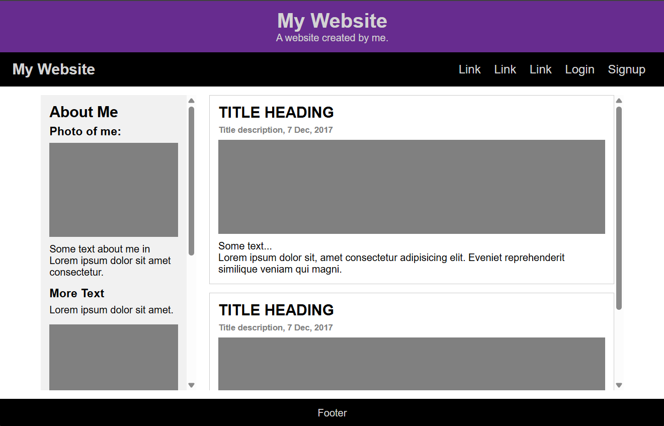


Description:
The Responsive Sidebar project is a flexible layout design that adapts seamlessly to different screen sizes. It includes a sidebar navigation menu that remains visible on larger screens and transforms into a collapsible menu on smaller devices.
Key Features:
- A sidebar layout that adapts to different screen sizes
- A collapsible navigation menu for mobile views
- Clean and structured design using Flexbox
- Simple yet effective user interactions
Challenges and Learnings:
This project reinforced my understanding of responsive design principles, particularly using Flexbox and media queries to create adaptable layouts. Implementing the JavaScript toggle for the menu was a great opportunity to enhance interactivity while keeping the code lightweight and efficient.
